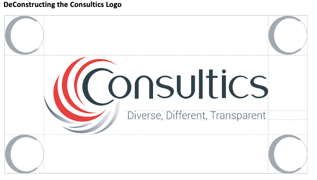
The Consultics’ logo is its mark. It is immediately recognizable because it is clear, precise, and brings into the forefront exactly what a forward-thinking consulting agency does – it helps clients stop going around in circles.
Many businesses are lost in swirls and in a kind of trance, but Consultics helps them break that swirl by getting them onto the straight path, towards the completion of their business goals.
But how can a simple logo showing the company name and a tagline say so much? Being simplistic and yet managing to convey so many precise and easy-to-understand messages is one of the hardest things to do. We are always up to the challenge of finding situations, ideas, people, and locations that will bring a fruitful solution into focus while making it look effortless….
……so why would the creation of our very own logo be any different?
Don’t just take our word for it, take a look at everything that went into creating our mark on the market.
Logo inspiration
A logo is a piece of art and like with all art, it needs to resonate with the audience. The Consultics logo does this because it took its inspiration from Nature’s proof of Intelligence design and the Fibonacci spiral. This is what gives the logo its natural look, catches the human eye, and then holds the gaze on an image that feels innate.

Nature seems to do everything without much effort but in reality, it needs extreme attention to detail and wisdom – just like our brand essence.
Logo Tagline
Some logos are just an image and others are accompanied by a catchphrase or tagline that communicates a message about the brand.
For Consultics this is “Diverse, Different, Transparent.” The tagline shows the exact three pillars on which the company is built:
· it is diverse – it can work on many levels due to its experience and knowledge
· it is different – it is consulting with a twist
· it is transparent – everything is on the table and our consultants work hand-in-hand with clients
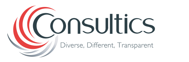
These three words are capitalised and separated with commas. This shows that all three are equally important and that the one feeds into the other.
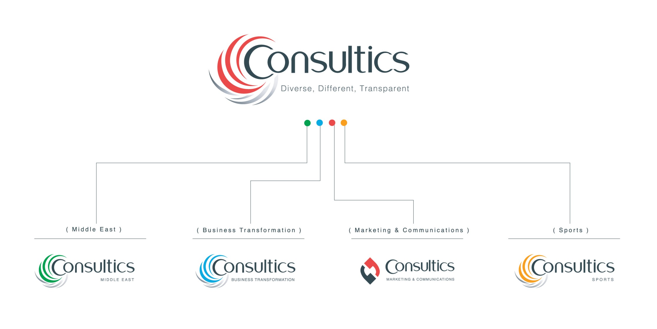
Identity Architecture
Consultics has four main business segments: Middle East, Business Transformation, Sports and Marketing & Communications. For the first three segments, the differentiating element is the different colours used in the swirl around the C. For Marketing and Communications, the primary colours are used to create a different design in place of the swirl. These techniques manage to maintain brand power throughout the segments while targeting distinct customer groups.
Black is a constant throughout the logo design of all business segments. It symbolises the seriousness of our communication strategy and the dignity we feel by upholding this stand.
Black is always married with one other colour that has been chosen very carefully so each segment is distinguished and has its own brand. This is done for the corporate and the four different market segment logos in the following manner:
· Corporate logo – Red. Red symbolises the pride of the Cypriot nation and the responsibility we bear in contributing to the development of the Cypriot market.
· Middle East Logo – Green. Green reminds us that Consultics Middle East is a considerate, thoughtful partner where knowledge and understanding of the cross-border structural program are apparent, especially with a market like the Middle East.
· Business Transformation Logo – Blue. Blue presents Consultics Business Transformation’s endurance, enhancement, and ability to embrace change for both individuals and businesses as a response to shifting market conditions, eroding competitive standing, and deteriorating financial results.
· Sports Logo – Yellow/ Orange. Shades of yellow and orange convey the transparency and passion we pride ourselves on at Consultics Sports. As it is the colour of sunshine, it can uplift, inspire boldness and vitality.
· Marketing and Communications – Same corporate colours, different design. Consultics Marketing & Communications uses black and red to produce an icon that is made up of two reverse punctuation marks. These punctuation marks represent our motto “You speak, we listen!”
Consultics depicts what it does with an image and a tagline, it stands by its name because it does even more than what it states it will do – it goes further so its clients can reach the finish line of their objectives time and time again.

